
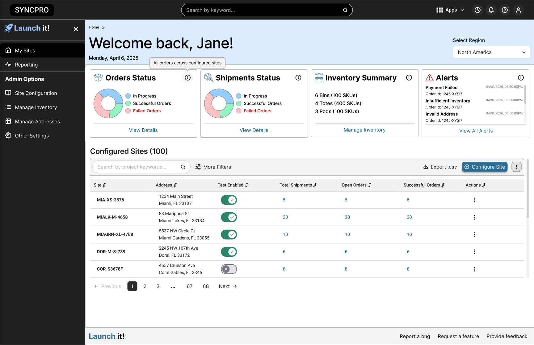
Simplifying operational testing for fulfillment centers
A 0→1 enterprise platform that brought site setup, testing, and monitoring into one system, so teams could decide faster whether a site was ready to launch.
Brand: Amazon
Role: UX Designer
Timeline: 2024-2026
For NDA confidentiality purposes
Original product imagery has been omitted.
This case study uses generalized language, and mock data to protect proprietary information while preserving the design process and outcomes.
UX impact
0→ 1
Consolidated tools into one.
4.6/5
CSAT after MVP launch
Days→hours
Site setup for quality testing
My role
Designer on a 0→1 launch readiness platform. I led design for one system to set up sites, manage mock inventory, create test orders, and track results.
✅ Led design for the whole system
✅ Co-led decisions with product and engineering
✅ Simplified complex technical workflows
✅ Shaped the MVP under tight deadlines
The challenge
Readiness testing ran on scattered tools, manual workarounds, and spreadsheets, and setting up one site could take days. The work was also physical: users walked live sites with heavy laptops, switching between the walkthrough and their dashboards.
They needed one system to set up sites, manage mock inventory, generate orders, and track results.
Opportunities
Simplify technical workflow
The existing process relied on multiple tools, manual setup steps, and workarounds that slowed testing down.
Design for real world environments
Site visits showed users walking live spaces with heavy laptops, splitting attention between the walkthrough and the dashboard.
Unify setup, execution, and monitoring
Users needed one place to configure sites, manage mock inventory, generate orders, and track results in real time.
My approach
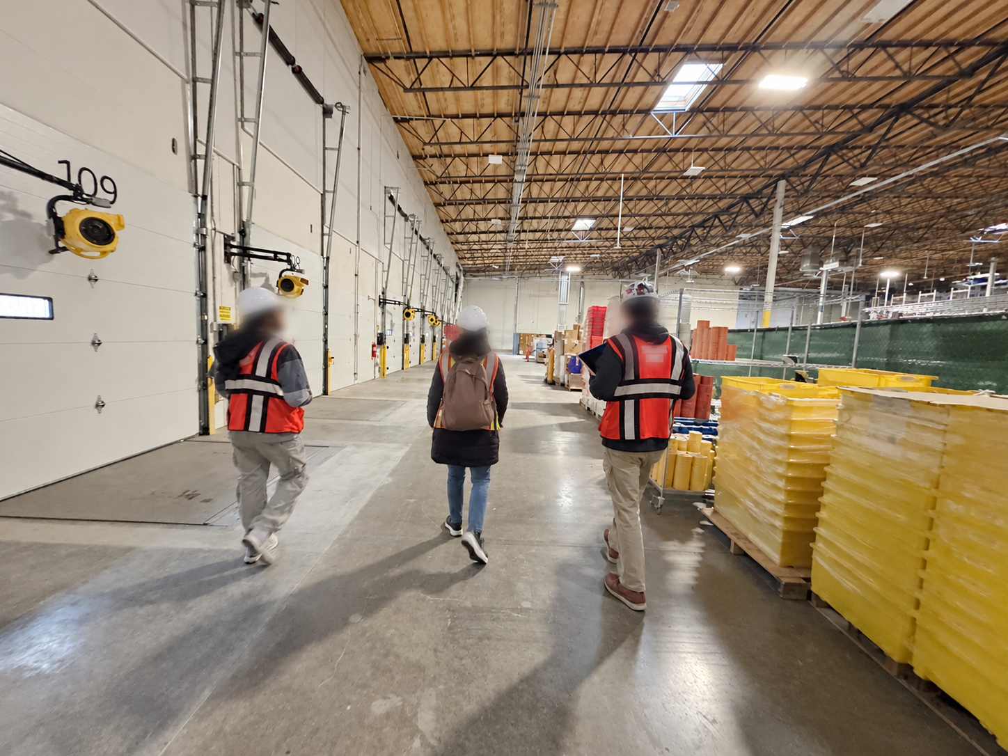
Contextual inquiry (Site Visits)
Over six months, we visited 5+ fulfillment centers across the country. I walked the floor and watched people run quality tests. Interviews only get you so far. Seeing it in person showed me where people got stuck, and which problems kept coming up.
What we learned:
✓ Setup took too long
✓ Too many tools to juggle
✓ People test while walking
✓ Noise and lighting changed how screens were used
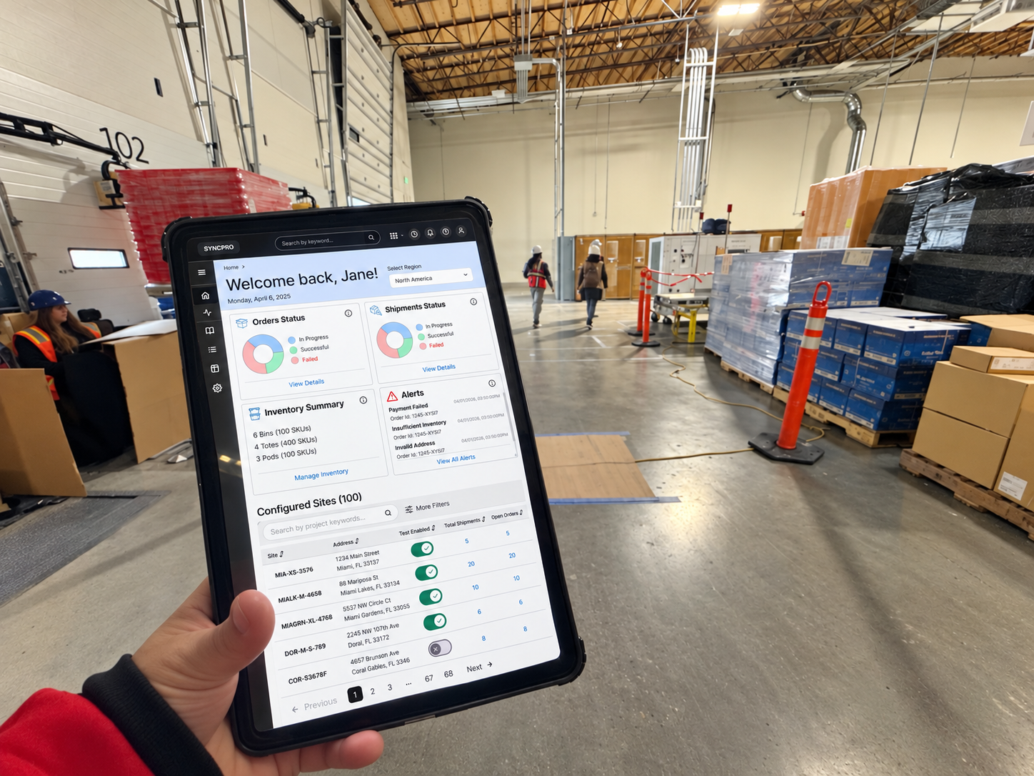
Workflow mapping, prototyping and responsive design
I mapped the testing workflow and picked what to build first. Then I tested clickable prototypes live, editing in Figma while users watched. Everything was tablet first, built for people on the move.
What we shaped:
✓ Setup that takes hours, not days
✓ Fewer tools to juggle
✓ Dashboards you can read at a glance
✓ Tablet-first layouts for people on the move
Defining operational readiness
Results and impact
✅ Faster test setup
Reduced a process that once took days into a workflow that could be completed in 1–2 hours.
✅ Accessible in the field
Tablet-first responsive design improved readability and usability in active site environments.
✅ User satisfaction
After launch, users rated the MVP 4.6/5 CSAT.
✅ Business value
The MVP phase contributed to an estimated ~$10M in savings through simplification and automation.
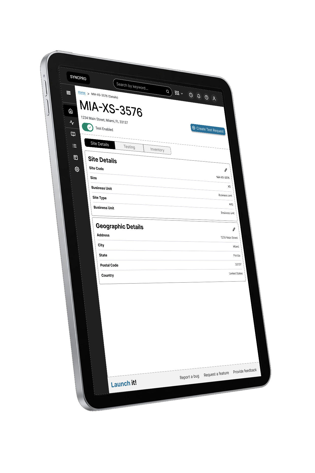
We simplified.
We validated.
We launched.
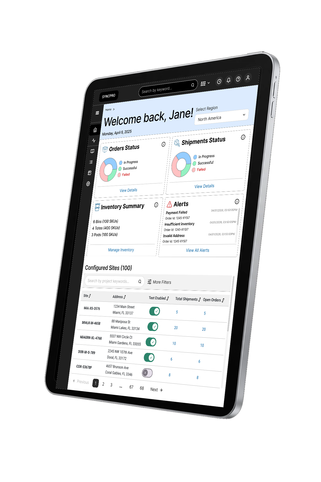
Tested on tablets and laptops throughout.
Reflection
Priorities shifted and deadlines forced hard calls. Watching people work on site changed my decisions more than any meeting did. It pushed me toward tablet-first layouts, bigger touch targets, and fewer steps, because that is what the job required.