
Unifying program management
A 0→1 enterprise platform that replaced fragmented workflows with one system for tracking work, sharing updates, and reporting project health.
Brand: Amazon
Role: UX Designer
Timeline: 2024-2026
For NDA confidentiality purposes
Original product imagery has been omitted.
This case study uses generalized language, and mock data to protect proprietary information while preserving the design process and outcomes.
UX impact
0→1
MVP Launched in 12 months
4.38/5
CSAT after 3 quarters (up from 3.5)
1k → 4K
Monthly users within three quarters of launch
My role
Designer on a 0→1 enterprise program management platform. I led design from discovery to launch, shaping one system for projects, updates, and reporting across three user types.
✅ Co-led research and workshops with product managers
✅ Mapped user journeys and workflows
✅ Prototyped and validated concepts with users
✅ Shaped MVP scope as priorities shifted, alongside product and engineering
The challenge
Teams across regions had no shared way to manage projects or report progress. Each built its own process, so the same update lived in three places and the same work had different names. Leadership couldn’t see what was happening across the organization.
The goal was a tool people would actually adopt: less manual work, without forcing teams to change how they worked overnight.
My approach
Discover
Co-led interviews, workshops, and contextual inquiry to find where the work was breaking.
Define
Mapped journeys across personas and helped define phase one MVP scope with product and engineering. Prototyped and tested concepts with users.
Improve
Used post-launch feedback to find usability gaps early and refine the experience as usage grew.
Pain points
Manual repetitive updates
Teams copied the same status across multiple tools with no single source of truth, creating unnecessary rework every cycle.
Terminology mismatches
Different teams used different language for the same work, making unified reporting to leadership inconsistent and unreliable
No dependency visibility
When one team's work unblocked another, there was no way to know. People found out by asking around or missing deadlines.
Disconnected tools
Users toggled between several platforms to complete one workflow, creating friction and scattered, inconsistent data.
Framing user needs through
Jobs to Be Done (JTBD)
To better understand what users were ultimately trying to accomplish, I mapped their needs through a Jobs to Be Done (JTBD). This helped shift the focus away from features and toward the real outcomes users needed to achieve across planning, coordination, and execution.
Persona
Three personas shaped the product: central PMs/admins, project managers, and leaders/viewers.
Visualizing the user journey
Identifying where to focus on.
Information Architecture
Navigation + site map
NorthStar had to serve three very different user types while still handling the complexity of enterprise program management.
The house analogy
To communicate the IA structure across the team, I used a house analogy, where pages are rooms, actions are functions, and components are furniture. Every room exists for a purpose.
This framework helped:
Stay aligned on why each page existed during MVP definition
Prevent scope creep by questioning every new page against its purpose
Explain UX decisions to leadership and engineering in plain terms, which helped get buy-in early.
Navigation depth goal
I kept every critical workflow within 1 to 3 clicks of the home page, so users could find a project, timeline, or task list without digging through menus.
Permission-based navigation
I designed each persona's navigation intentionally around their Jobs to Be Done, only surfacing the pages and actions relevant to their specific outcomes.
Central PMs/Admins: configure, manage and scale the platform across teams
Project Managers: execute, track and coordinate day-to-day work
Leaders/Viewers: monitor portfolio health and communicate status upward without operational noise.
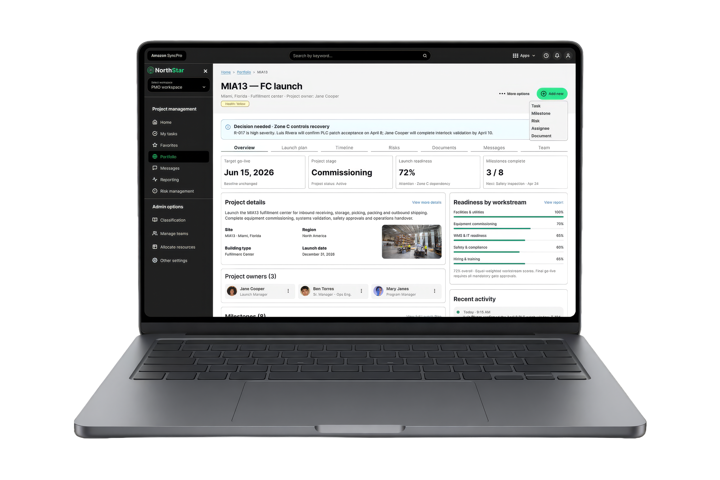
The opportunity was to create a unified system that improved visibility, reduced friction, and still supported the needs of different users.
Results and impact
✅ More consistent workflows
Bringing scattered tools into one platform gave teams one structured way to manage projects and share updates.
✅ Higher adoption
Monthly users grew from 1,000 to 4,000 within three quarters of launch.
✅ Clearer reporting
Standard dashboards made it easier for admins and leaders to see progress, risks, and project health.
✅ Improved satisfaction
Post-launch feedback helped uncover usability gaps early. CSAT rose from 3.53 to 4.38 out of 5 over the first three quarters.
Wireframes
Note: All Amazon confidential data has been replaced with mock data for the following designs. This is what we’re allowed to show.
Home page
Project details (sidesheet)
Project details page
Create new project (AI assistance)
We built.
We measured.
We learned.
Reflection
NorthStar taught me that enterprise design is mostly about alignment. The hard part was balancing multiple user types, shifting product direction, and business priorities, then landing on something the team could realistically launch.
It sharpened how I define an MVP under pressure and use research to guide decisions. It also showed me that some of the most important improvements happen after launch, once real usage shows where the experience needs to change.